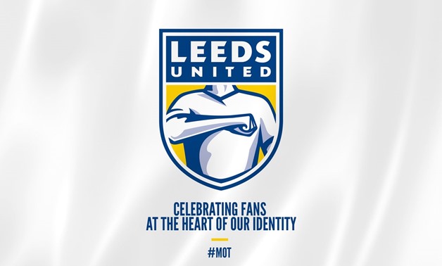
Leeds United’s new shield, Courtesy of Leeds United official account on Twitter
CAIRO - 25 January 2018: Leeds United presented on Wednesday a new logo, with the intention of renovating the brand of the club ahead of its centenary, which will be next season.
What the historic Yorkshire club did not expect was that the decision would raise a lot of controversy among their own fans.
The club reported that it had been conducting a study for six months to develop the new logo, and that it consulted with more than 10,000 people, connected in some way with the club.
The new logo, however, did not receive good reviews in the networks.
The reactions in the networks ranged from describing the logo as "horrible" to cataloging it as "absolutely tragic" by fan groups. Others said that the design seemed to emulate “a guy trying to win his place with his elbow in the pub.”
In the new logo, the club wanted to highlight the “Leeds greeting”. This is why a large part of the design shows a torso with the right fist to the heart, embodying the traditional greeting of the city.
Comments
Leave a Comment